
With my designs done I wanted to put them all in one document so that I could briefly analyse them. I will also include ones that I didn't choose to print for my final product with reasons why.
Design One - My Thoughts Are Stars
Critical Thinking

This was the first time where I had used my own handwriting and just 'decorated' it slightly, something I was inspired to do after reading the article on The Fozzy Book called Writing with your handwriting. This really opened my eyes and made me realise that the best tools we have are right in front of us, even if it's a little thing like our own handwriting.
I scribbled the thicker strokes so that it looked like a child was roughly colouring in a colouring book to hint at our childish nature, and the fact that the girl was relatively young even though she knows she acts older and knows that she could die at any minute. Her parents are always by her side and her mother accompanies her everywhere to make sure she is okay, as she is still their little girl who needs special care.
My main focus is on the type which was why I chose to do very thin, cartoon-y stars so that they don't take away any attention from it. I did these relatively quickly much like I did when shading in the thicker strokes in the type. The minimalist appearance to this design allows the reader to draw up their own conclusions to the quote and it produces a very clean, crisp design.
This design thus strongly connects with the story "The Fault in Our Stars" by John Green, and would be a good design for my book.
N.B Later on I edited this design slightly and added a line through "f" so that it looked more like an f, following my lecturer's suggestion.
Existing Designs - Comparison
Out of curiosity I had a look at existing designs done for this book.

Looking at some of these existing designs I realise that it was a good idea to choose hand-lettering because it seems to be one of the strongest factors in these designs, especially from the actual book cover which also features hand-lettering (in what seems to be done by chalk). The main different between my handwriting and the lettering in these designs, however, is that they're mostly uppercase to mimic the book cover.
Most of these designs have also mimicked the cover by using their colours as blue, white and black are the 'signature' colours of this book. I am glad that my design breaks from the traditions of using these colours because it would be too obvious otherwise. I felt that it would look too 'boring' because it has already been done so many times and what I aim in design is to do something completely different. I am glad that there are other designs that don't use this colour as well - such as no.6 done by Risa Rodil - because it shows that I am not the only one who doesn't want to create an obvious design.
Even though I've used different colours my design has nevertheless the same message as the book because it's delicate, and I feel that some of the designs doesn't reflect the sad side of the story that the characters are running out of time but just want to appear like the book cover.
To conclude, I think that it's good that my design is quite different to some existing designs because it shows how each of us have our own take on the story. The ones showcased on the above mood board aren't the only designs that have been done, there are many others, and I feel that because mine is so different it makes me more memorable and stands out from the rest.
Design Two - Tsunami Tides

Critical Thinking
I'm not so sure about this one because it isn't a quote but lyrics from U. N. I by Ed Sheeran. This means that it wouldn't fit in with the brief because it isn't from literature and wouldn't be connected to the Oxford Literary Festival. Nevertheless I shall juggle the strong and weak points of this design.
I'm not so sure about this one because it isn't a quote but lyrics from U. N. I by Ed Sheeran. This means that it wouldn't fit in with the brief because it isn't from literature and wouldn't be connected to the Oxford Literary Festival. Nevertheless I shall juggle the strong and weak points of this design.
One of the strongest points is the way I've connected the type to the overall emotion of the song, where he laments breaking up with his girlfriend. I dropped some water on some of the letters to imitate what happens when tears fall on a page when writing and to create a link to the actual quote where he talks about how he still cries for her. The random placement of these droplets does make it seem more eligible.
However I feel that even though there is clearly a strong structure to the design, that the cursive handwriting seems slightly out of place as it doesn't fit within the confines of this "grid" that surrounds the other lines. The lettering form is very fragile so I feel that the words could've been slightly shorter and thicker to make them "stronger". Perhaps it would've been better if the larger words were done with a wider nibbed dip pen?
I feel that the wave could distract the viewer so I should've made it slightly smaller to act as a little scribble/doodle at the bottom of the page.
All in all, I don't think that this piece is particularly ideal for my book as it isn't really classed as a quote as such. It also doesn't derive from literature and so wouldn't fit in with the whole aspect of an literary festival.
Design Three - My Dream

Critical Thinking
I feel that this design might not be suitable because it looks more like a Valentine's Day card than something that should be included within a book. This would be due to the fact that I did take inspiration from Valentine's cards but I have taken a bit too much inspiration from it and have included all of their "characteristics": the light, pastel colours; soft forms; and soft curves for the lettering.
The lettering is quite fun which heavily contrasts with the previous two pieces, although I find that because of this it doesn't really connect to the story that the quote derives from. "The Notebook" is actually quite a sad story about the couple that although they were together for the rest of their lives, the woman suffers from memory loss, and so the husband has to repeat her the story over and over. This design only touches the surface of the message where I had drawn clouds and stars to reflect the word "dream", but nothing else.
It is because of this that I decided not to carry on with this quote because it's like what happened with my Nelson Mandela piece where I didn't really do intense research to discover the meaning behind it or read the story. I didn't think that it was aesthetically fitting for my target market as they would be very knowledgable of their books and might not read "contemporary" books but would know of "classics" such as Pride and Prejudice, The Adventures of Sherlock Holmes, and Lord of the Rings etc.
Design Four - You are You

Critical Thinking
This is actually one of my least-favourite designs out of all of the ones I have done, and it's mainly because I had worked so long on it. If I hadn't had worked so long then I would've liked it a bit more as I have been able to incorporate as many type styles as possible to achieve that fun appearance. This “fun” aspect reflects Dr. Seuss' work where he has comical little characters and an interesting array of colours in his work. The quote itself is quite amusing as he used non-existent words such as “youer”.
It is quite an upbeat and positive quote and so I tried to include as many bright colours as possible, and included yellow as it's known to be a colour symbolising happiness according to [here].
I have also included the famous “Dr. Seuss hat” to act as a little icon atop of the credits on the left-hand side. I decided to include this so that it was clear that the type on the other side was actually within the shape of this hat as I felt that it wasn't clear enough if it was left alone.
This tone of blue is also known to be his signature colour so I tried to use it within my design as much as possible. It was this colour that people actually picked up on when I showed it to my audience (that, and the hat).
I also noticed that he seems to rely on sans serif fonts, of which I have also done in most of my design. I adapted this sans serif style but adding on 3D effects as well as scribbled in borders which was inspired by Steve Simpson's pieces. He managed to incorporate as many styles as possible and yet still achieve a very strong design.
I find that because I had painted it digitally it had lost a bit of it's traditional texture, however, I incorporated the traditional texture of the pen when drawing out the type. This feature adds dominance to the type and I also made sure that it quite large on the page.
Despite the fact that I don't like it as much as my other designs, I still find it very strong in terms of it's link to Dr. Seuss' work and that I had actually done my research to figure out what his signature colours were.
Existing Designs - Comparison

In order to compare my design properly against the chosen market I included those that I used as inspiration before my sketching and designing process. Most of these consisted of a wide variety of colours and unusual letter forms, especially those seem in Bob and Roberta Smith's work. My main focus was how Dr. Seuss used his colours in his design and I noticed that he chose quite contrasting colours.
By using similar sort of colours that he had displayed on his covers I have created a clear connection with him. I decided to add on new effects to his sans serif style which was heavily influenced by Steve Simpson, Pattern Daily, and Mary Kate McDevitt. I also used a similar style from a Paperchase card.
If I place my design beside all of the ones featured above, it would fit in perfectly with this style of lettering as it's "fun" and unusual. I've followed the trend of where my colour palette consisted of no more than three colours, which has been reflected in the existing designs.
Design Five - It Always Seems Impossible Until it's Done

Critical Thinking
I believe this is one of my strongest pieces I have done so far and it's mainly because of the connections I created between my design and Nelson Mandela's life. In terms of aesthetics, I imitated his painting "Hand of Africa" by making the hands appear as if it was either linocut or inked in (and it actually was inked in). These block colours only increase the colour's dominance within the piece as there are no shades of grey, creating a very strong appearance.
These strong colours contrast with the delicate handwriting that I used for the type. This is in fact my own handwriting as I noticed that it added a personal touch to the design as it has all of those little “mistakes” that humans make when writing. This thus reflects the mistakes that Nelson Mandela had made during his time, but it is these mistakes that helps them to build the foundations of South Africa.
In terms of his personal life, I captured an important moment in Nelson Mandela's - and for the whole of South Africa, in fact - life as this handshake took place right after he was released. Instead of responding with violence he took President de Klerk's hand and raised it to the general public to show his peace. The ribbon that entwines around the hands intensifies the union of peace that I wanted to include within my design.
This design is a perfect example of how research could effect my design, of which I had explained in my presentation when I talked about my designs so far. My original design consisted of birds surrounding the quote with papercut aesthetics, but it was nowhere near as strong as this piece as it didn't relate to his work. In this design I had included his prison number “46664” which shows that I had actually done my research and didn't just create a design that matched only the surface matter and not the actual message of the quote.
All of the above are reasons why I thought that this design was strong enough to be featured in my book despite it not having been derived from literature. Luckily, the Oxford Literature Festival does indeed cover politics and therefore there is a place for this design.
Existing Designs - Comparison

image sources: (1) (2) (3) (4) (5) (6)
There is definitely a trend in doing hand-lettering for this kind of quote (with only one or two design as an exception) therefore mine fits into this kind of market. These designs show that hand-lettering has become more and more popular and people seem to be purchasing these more rather than computer generated designs.
What sets my design apart, however, is the strong presence of illustration which seems to be lacking somewhat in these designs. There are a few with illustrative features such as banners and borders, but most rely solely on hand-lettering. I find that these lack the deeper meaning of the quote due to having no illustrations, although they have used hand-lettering that looks quite a lot like handwriting and so there is still that personal touch to it.
I find that the ones done in black & white is stronger than the ones in colour as that could provide the connection to Mandela's work. I am glad I hadn't done any more colours in my design because that would've lost it's impact.
To conclude, although my design is quite similar to these I find that it's set apart through the use of illustration and it actually producing connotations of South Africa and Nelson Mandela's work.
Design Six - Not All Those Who Wander Are Lost

Critical Thinking
One of the strong points of this design is the fact that there is a strong resemblance between this map and the one featured in the Lord of the Rings novels and films. I looked closely at their maps during my research stage and tried to imitate their lettering as much as I could, having noticed that there is a strong uncial lettering influence in their designs. Having known their inspirational resource I also took the time to have a look at uncial lettering to try it out for my design.
I took my time when practising with uncial lettering and this is clearly shown in my design, as when I showed it to my classmates and the general public they had all thought I had used an existing font and so it surprised them that I did it by hand. Normally I wouldn't like my lettering being thought of as computer generated as I want my lettering to show human flaws, hence why I tried to keep the gradient that ink creates. This is clearly shown in the word “wander”.
The piece relates strongly to the overall message of the quote and that it's connected to Aragorn, son of Arathorn, who was to become king of Gondor (and therefore have a high influence in Middle Earth). He spent most of his life as “Strider” who was a Ranger of the North, and therefore travelled a lot in his time. This is why I had chosen to produce the image of the map and set all of the words apart from “wander” on a road. “Wander” is set apart because it's placed away from roads, which shows Aragorn's nature and that he knows the land so well that he doesn't necessarily have to go by well-known routes.
I decided to include the Tree of Gondor as I believed that that was also relevant to Aragorn's story as it's the emblem of his ancestors and later on he wore it on his armour when crowned king. As I didn't want to overcrowd my design I used the emblem as a compass.
One of the aspects that I didn't include within my map are place-names as I believed that this will only distract the viewer from the main quote. My other reason is that my map doesn't actually resemble theirs and so I would have to make up my own place-names which will set my design further apart. To make up for the lack of place-names I added in some small illustrations of dragons and ships, which I had been inspired by medieval and vintage maps as well as the map shown in The Hobbit.
I thought this design was ideal for my book as it derived from one of the most well-known books in the world, and as it's quite an old book I would class it as a “classic”. This means that the viewers and readers would instantly recognise this piece and it's connections to Lord of the Rings (and perhaps Aragorn, for those who have read the books).
Similar Designs - Comparison
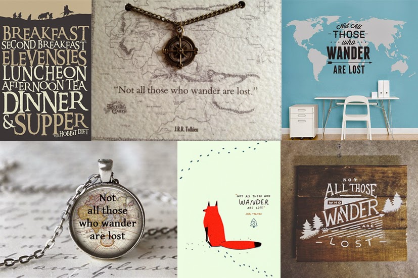
image sources: (1) (2) (3: unknown) (4) (5) (6)
Other existing designs have also incorporate maps which shows that mine would fit easily in this kind of market. However, as their maps are completely different to the ones showcased in Lord of the Rings it's hard to tell whether or not they did it because the sentence itself brings connotations of travel, or they had drawn up it's connection to Aragorn. The only ones that I can safely say are related to Lord of the Rings is the first and second one on the top line.
Overall, my design is ideal for the "Lord of the Rings market" because it's so recognisably influenced by it.
Design Seven - The Remarkable Rocket

Critical Thinking
This is another one of my incomplete designs that I decided not to put forward and develop in the end after having a chat with one of my family friends. I realised that I didn't have enough time to do this and another two designs so instead I chose to design two that were from "classic" literature (i.e. Moby Dick and The Raven).
I wasn't too sure about this design because I found that it lacked structure and I wasn't happy with some of the inaccuracies within the type. It did have that fun atmosphere but I felt that it could've been a lot stronger had I changed the composition and followed 'set' structures such as the ones shown in Tobias Saul's work (who inspired me on my Moby Dick piece).
I felt that the quote I used might not be well received with my target audience because it's quite sarcastic and it was hard to show that it was actually the rocket who was saying these words. It was quite a challenging quote as I wanted to make it as "funny" as possible by throwing in as many type designs as possible like I had done for my Dr. Seuss piece and using a variety of colours.
I believe that it's the colours that really put me off developing this design; I wanted it to retain that traditional appearance but the colours I used here dampened it down. The border I had included around the last section looks messy now that it was coloured in which shows how inexperienced I am with hand-lettering.
I am glad that I did move on from this design as it allowed me to spend more time on Moby Dick and The Raven, both of which have become one of my favourite designs. It has also taught me that if I was stuck I could simply move onto designing something else as I might be more inspired when I come back to it. Unfortunately, I haven't the time to develop this before my deadline but I would like to try it again afterwards in my spare time.
Design Eight - Moby Dick

Critical Thinking
This design clearly shows my development in hand lettering and there's such a big leap from this one to my unfinished one that I had done previously. The type is more accurate now in terms of kerning and x-height, and I began to consider composition in greater detail.
I tried to produce as many "hidden" aspects that would produce connotations of the novel. I made "Ishmael" look like bones or the spinal structure of a seahorse (shown clearly in "s"), and added in some small dots so that they looked like air bubbles. I was influenced by vintage typography and the ones used in Victorian posters (examples: here) as well as Tobias Saul's work "The Drunken Sailor".
The other type design was influenced by the harpoon that evidently brought Captain Ahab and the rest of his crew down with Moby Dick. It's unclear whether Moby Dick actually survived but I thought that it was important to try and include it somewhere in my design. I also used harpoons on the small illustration on the left-hand page, as Moby Dick was known to be scarred and have several harpoons embedded in him.
I carried the harpoon-style type across to the other side as it was quite minimalist compared to the other one and so would be easier to read at a smaller scale. I tried not to make this design have too many elements as I wanted the focus to be on the main illustration, although I did want to include some aspects of my previous sketch. It was this design that gave me the idea to have an "icon" on all of the other designs so that they didn't look as if they were hurriedly thrown together and actually allowed them to form one, whole design.
I made the illustration itself quite minimalist as I knew that if I had drawn it in any more detail than the design would look too "heavy", especially with the grunge background. I added in some small lines to hint at sea foam and waves and to separate it from the whale which I made plain so that it would stand out against the detail. This makes the whale the central focus of the overall piece.
I included this grunge texture as I found that without a background it was too plain and that it needed a small lift, and I made sure that it was uneven so that connotations of the sea bed would be produced. I tried to find a textured/grainy background as possible to achieve this effect.
This is also ideal for my book because not only does it feature a very well-known opening line, it is quite strong as a design due to the fact that I had taken care when considering the type choices and made them as accurate as possible.
Similar Designs - Comparison
 image sources: (1) (2) (3) (4) (5) (6)
I got quite a lot of my inspiration from existing book covers, especially those that had strong line work such as the Penguin Classics design. There is definitely an emphasis on illustration here which is quite different to the other designs that I had looked at that seemed to rely more on typography, which is why I enjoyed flicking through these designs and using them as inspiration. The bottom left is an exception of this, but it did inspire me on how to draw my whale in a minimalist manner.
The whale is the reoccurring character throughout all of these book designs so I made the right choice in choosing him as the main focus on my design. This would also mean that my design would be easily recognisable as I chose one of the main characters in the story (in fact, everything is based around hunting down Moby Dick despite it actually not making many appearances in the book). Some of these designs have included the boat in their illustration which I didn't do as I wanted to create the effect that someone is looking at the whale through a spyglass (hence why it's in a circular format). This sets my design apart from the others; these designs show another person's point of view that is watching the scene in the distance, but I have placed the viewer in Captain Ahab's position and in the actual scene.
The colour palette of all of these designs is quite muted, which I have also done in my design, and this could be because the muted grey/blue creates a very vintage effect combined with the delicate line art.
Overall, my design fits really well with these designs yet it's set apart by the way I have done it so that I'm placing the viewer directly in the scene. I quite liked how these designs have kept their whale quite minimalist yet have it surrounded by detailed lines.
Design Nine - The Raven

Critical Thinking
This is another design that I favoured because here is another example of how my hand lettering has improved. I spent quite a lot of time making my letters the same thickness as well as their serifs, and even though this did take quite a while it did prove very successful. I had some difficulties making sure that I got the curve right but I got there in the end.
It was actually the first design where I had focused first on the illustration and then on the type. I analysed Edgar Allan Poe's poem and found that one of the reoccurring subjects within it was the narrator's lost wife, Lenore, whom he still hadn't gotten over. I found that she was actually quite important because right at the end he asks the Raven if he could see her in heaven of which it replies, “Nevermore”, which enrages him and therefore the pace of the poem picks up the more agitated he gets.
I wanted to shield her behind the Raven to reflect the fact that the Raven was the one to confirm whether or not the narrator would be able to see her again in the afterlife. The narrator has nearly forgotten her face so it also shows his fading memory of her. I surrounded her and the Raven with feathers to imitate chaos and confusion, but made them slightly lighter than them so that they are brought out of the page slightly and become the main focus.
I carried the feathers across to the other page to emphasise this chaos as I thought that without it it made the page look a bit too plain. The black and white colour scheme reminded me of silent movies, which is also a good connotation for this design because of the fact that the Raven went silent after the brief interaction with the narrator and remained perched atop of “the pallid bust of Pallas”. Another aspect that reminds me of silent movies is how I did my type so that it looked a bit like piano keys.
The type was inspired by Blackletter typography but I tried to lessen it's decoration by merging it with a serif style. It brings connotations of gothic architecture and a gloomy atmosphere, and it's strict structure reflects the style etched on gravestones. I was inspired by the way my type looked in a previous design of mine, Avicide, and liked the way all of the letters were in uppercase but the “true” uppercase ones were slightly taller. I kept in the little dots that my ink made while I was inking so that it was more authentic and emphasised that it was done by hand and not by computer.
I included this design within my book because this poem is quite well-known to those interested in Victorian literature, and it's quite different to the ones I have done before as there is a strong emphasis on illustration.
Existing Designs - Comparison

image sources: (1) (2) (3) (4) (5: unknown) (6: unknown)
Like my design, there is quite a strong emphasise on illustration within these designs and the illustrators seems to focus more on the raven itself. This is probably one of the few set of designs that I had taken inspiration from that featured illustrative type rather than having it as a separate feature. This is clearly shown in the second image on the top row, where the illustrator had placed the word “nevermore” within the bird. The one on the bottom left looks as if it's a small sketch within the narrator's book as the type is quite hurried and smudged, and it forms around the bird.
There colour palette is also quite limited to play on that gothic atmosphere, which I had also used within my design. I am glad that I didn't go with the decision of adding some colour because I feel that black and white pieces are very strong because it allows the viewer to mainly focus on the illustration rather than be distracted by any colours.
There are only one or two designs that I had looked at that included Lenore within it, and I find that she was one of the most important characters within the poem and the fact that most of these designs didn't include her sets my design apart. Those who haven't read the poem yet know of it would be quite intrigued when they see that I had included Lenore in my design, and perhaps would find out for themselves of why I included her.
This “interaction” brings my viewer into my design as it attracts their curiosity, hence why I want to include it within my book and feature it on a poster design.
Design Ten - Book Cover

Critical Thinking
I have continuously revised this design so that it's what you see right now, and it's because I was having such an artist block with it. I found it difficult to work with the confines of my target market as I wanted to create something clean and professional for the Oxford Literary Festival, having gotten a few ideas from the Penguin Classic book designs.
However I am glad that I did take a breather to focus on creating my double-paged spreads before going back to this because it allowed me to recharge my batteries and I was as inspired as ever. I went back to the sketches that I thought were ideal to develop and scrapped the idea of creating a patterned background with serif type so that it was more reliant on illustration. I realised that illustration was my strongest point and so I wanted to use it as much as possible, especially because this design is what will sell the book and make the people want to look inside.
I tried to make this design reflect what was on the inside by using illustration as well as creating similar type styles. “Quotes” was inspired by the type I drew up for Moby Dick, and the serif was too inspired by it but I used redundancy to make it less decorative. “Quotes” is clearly the more dominant type as the strokes are thicker and I added more decoration to it.
The reason why I chose to use the serif style is because when I looked and analysed Oxford Literary Festival's website I noticed that they used a serif throughout the whole of their website. Serif also has that “strong” appearance as the serifs supports its structure, and I softened this a bit by making them quite small and choosing a charcoal grey colour as opposed to black.
The swirls guides the viewer around the cover; starting from the top where it hides behind the banner and then encircling around “quotes” before finishing at the book. This “flow” could be viewed in the opposite way as well so that it appears that the swirls are rising from the book which would lead the viewer back up the page.
I used a monotone colour scheme for this cover and restricted myself to using no more than three colours so that the focus was solely on the piece. This colour palette was inspired by some vintage typography featured in the book: “New Vintage Type: Classic Fonts for the Digital Age" by Steven Heller and Gail Anderson. The primary colours for the festival's website were also black and white and they did add a hint of colour for the headings, which was another reason why I wanted to focus on just two main colours that were quite similar to this. I feel that there is a certain professional and elegant appearance when using a monotone palette as it's so minimalist. The gold only adds a 'royal' tone.
Existing Designs - Comparison

image sources: (1) (2) (3) (4) (5) (6)
It was quite hard to compare my design to those within my subject area so I have just displayed those that I took inspiration from throughout the process. The one done for “Ely” isn't a book cover but I have included it because it's the one that I drew a lot of inspiration from.
All of the above have displayed illustrations, which pleasantly surprised me because it shows a growth in an image-based market. This might also be a sign of the beginnings of hand-lettering being used in book covers; such is shown in Simon Drew's illustrated book of Oscar Wilde's quotes and Black Beauty by Mary Kate McDevitt. My design thus fits into the target market because even though it has been hand-lettered I tried to make it as clean and professional as possible so that it resembles an existing font (although it is clear that it was hand-drawn).
I would've said that my design is perhaps a bit too illustrative but after seeing Mary Kate McDevitt's design I am glad to see that detail isn't necessarily a bad thing, and could actually strengthen the front cover. I did try to include some minimalist aspects such as having a simple form for the banner, and I made sure that my type didn't consist of more than one colour. “Quotes” does, however, have different shades of the one colour, but it is still quite minimalist.
I've noticed that most of these designs display a serif style font which means that mine wouldn't be deemed as too professional as these designs show that serif can work in a friendly manner through the use of colour and form. The serifs in most of these are quite short and thick, which softens the overall appearance. The Charles Dickens and Oscar Wilde books are exceptions to this rule.
Overall I am quite sure that my design would fit within my target market as there has been a rise in using illustration and hand-lettering on book covers, as shown in the above designs. Hopefully there will be more books in future that uses both of these aspects, but I am glad that illustration remains strong.
Reflective Thinking - Summary
This post has allowed me to reflect on the strong and weaker parts of each design, which has also allowed me to make a decision on which ones to include within my book. It also allows me to point out anything that I would like to work on in future when I continue my route to hand lettering and I really would love to venture into the more illustrative type sector.
It also allows me to explain my reasons of choice within one post despite me repeating some of the points previously dotted around other posts. This is so that it makes it easier for you to read instead of having to travel around my blog to figure out why I did this or that.
N.B That some of these designs have been updated continuously according to the adjustments I made.
Learning Outcomes:
[2] Developed a high level of intellectual and conceptual involvement with their chosen subject area, including skills of project proposal, documentation of project development and the presentation of outcomes.
[3] Developed written and oral skills of critical self-evaluation in relation to their design practice.
[6] Developed skills of critical thinking, analysis and evaluation.
No comments:
Post a Comment