
Even though it is a poetry book I am still quite interested to see the layout of each page and how they used illustration with typography.
 |
| Front and Back |
When I saw it I immediately thought of Jan Pienkowski and his silhouette illustrations, and this brought me back to the Brother's Grimm tales that I used to read when I was younger. The silhouettes are quite decorative; even the small ones on the borders are! The main focus is definitely on the illustration as the type is rather plain in comparison (although that could be because if it were any more decorative the overall appearance would be overpowering).
The price, barcode and logo are extremely clear on the back and are more dominant than the blurb because of the colour and size of the text. The blurb is centred, leaving plenty of room around it for the illustrations (which are also very decorative).

Okay so this was a bit unusual because the name of the illustrator isn't often that dominant inside books - not that I've seen anyway - so to see her name at a fairly large size makes the page seem a bit odd. I think they should've made the illustration slightly larger and her name smaller so that the main focus is on the author.
On the opposite page it had the usual credits and publisher list.
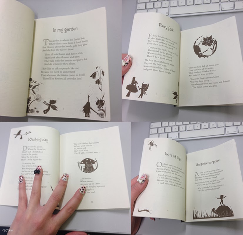
Even though the text is kind-of left-aligned, the margin on that side is extremely large and the same goes to the right-side on the opposite page. This is probably to let the illustrations have more room to breathe. Speaking of illustrations, they don't appear to be as detailed as the front covers which allows the reader to focus more on the words than the images. If a parent was reading tales to their child then it'll be easier for them to just show the images along the way without the child being engrossed in the design and ignoring the story. The colours aren't that bold either which gives the book a somewhat vintage appearance.
I'm not actually too keen on the way there is a river in the text alignment but I suppose it does grant the poem some sort of flow. It is an unusual layout but I think it kind of works because there's not much text on each page. It would just look like a jumbled mess had there been more !
The binding seems to be "Perfect Binding" that is used in quite a lot of books, and works very well here because there are only a few pages. If the book was any thicker I would imagine they'd use a different binding method. I think I'd like to experiment with this kind of binding although I'm worried that it wouldn't be substantial as I would only have around 2 pages! That is, of course, unless I produce more...
Measurements = 125x154mm
I do like the size of this book and I think that for now I shall follow the same dimensions for this project.
Reflective Learning - Summary:
Even though the subject matter of this book isn't completely related to what I'm going to produce but I thought it would be nice to see how the designer laid everything out and where are the illustrations placed. When I first saw it I realised that it was at the perfect size and thickness and kind of panicked because of how little pages my book would have. This made me think: maybe I should try to create as many quotes as possible?
The fact that it's completely unrelated does make it different however because there isn't much of a focus on illustration within the book, and illustration & hand-lettering is going to be the main aspect in mine. Displaying page numbers might not be good for me because I'd only have around two pages unless I was able to do more than that.
Taking photos and looking at the book allows me to figure out what to do when it comes to designing my book; I should place all of my credits on the inside page of the book, feature the authors name, and try to create that balance between negative space and text/imagery.
My next step is to now concentrate on doing as many quotes as possible so that I am able to create a book. It's going to be nerve-wrecking, but I can do it!
Learning Outcomes:
[4] Developed research skills in the area of contemporary professional practice.
[6] Developed skills of critical thinking, analysis and evaluation.
[8] Developed their ability to scan and organise data, abstract meaning from information and communicate knowledge in a variety of formats.
No comments:
Post a Comment